Monday 17 December 2012

Final Video and Evaluation

Final Video


Youtube = http://youtu.be/DahkKRPO024
Vimeo = https://vimeo.com/55016953

Critical Analysis:


Cooking Shots


 Strengths:
 - The cooking shots are nicely lit and everything in the shot is clear to see.
 - The shots are nicely composed and use rule of thirds well to make the shots more aesthetically pleasing.
 - The mid shot features a nice triangle composition as well as using the rule of thirds: she is stood on a third and the triangle is formed using the righthand pan, her elbow and her head with her facing the righthand pan to complete the shape.
 
Weaknesses:
 - Due to her height the top of her head is a little close to the top of the frame and this was the best composition that could be made.
 - The hob isn't actually turned on as it wasn't working, the plan was then to add the flames digitally in post but the editting ending up taking longer than expected and so this was left out.


Setting the Table Shots


 Strengths:
 - The mid and close shots are well lit and clean.
 - The wide shot features a rule of thirds composition where the table is in the bottom third and the wall takes up the right third.
 - The close shot uses a triangle composition from the top and bottom of the glass to the spoons, and everything you need to see is within the triangle.

Weaknesses:
 - The wide shot is a bit dark and the only time her face is sharp and clear is when she moves infront of the spotlight caused by the directional ceiling light.
 - The wide shot is also very grainy and noisey due to this low lighting.
 - The close up seems slightly over saturated which is apparent in the brighter areas at the end of the shot.
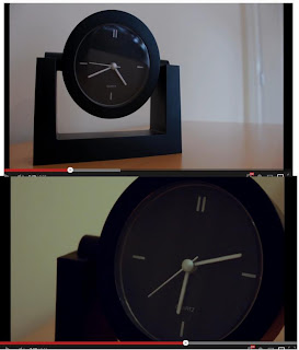

Time Lapse Shots


Strengths:
 - The shots are nicely composed using the rule of thirds.
 - The shots link together nicely using lighting due to how the second is later in the day and so the lighting was darkened somewhat.
 - The shots help push the narrative by how time is passing and she is getting more frustrated so the second shot is closer and more intense.

Weaknesses:
 - The shots are a bit too white and don't match the rest of the footage well because of this; they should have been graded a bit more orange to match the shots around them. - The glare on the clock in the first shot is a bit off putting and the glass should have been taken out of the clock really.


 Dinner Shots

 
Strengths:
- The shots is again composed using rule of third and triangles. The long tracking shot starts with the door covering two thirds, and then the track uses a reveal to finish on a composition where she is sat on a third line and a triangle can be formed between her and the two glasses, drawing the eye across the table.
 - The shots are all lit nicely and any key objects in the scene are clear to see. A gold reflecter board was used to mimic the orangey lighting seen in the kitchen earlier on.

Weaknesses:
 - The close up pan doesn't really follow any particular composition, however seems to still work quite nicely.


Coming Upstairs Shot


Strengths:
- The track runs smoothly throughout and Sarah is kept nicely in the middle of the frame the entire way through the movement.
- The composition of the shot was purely to keep Sarah in the centre of the shot as the narrative is starting to make her feel more alone and vunerable, so she would move off the thirds and into the centre of the frame. Instead, the barrier ends on the third.
- The shot is lit well and keeps in tone with the rest of the film so far, slowly moving away from the oranges of the kitchen by becoming more white.  

Weaknesses:
- The pan up at the start of the shot possibly takes away some of the nice horizontal movement and seems slightly unecessary.


At the Window Shot


Strengths:
 - The shot is composed nicely, keeping both the window and Sarah in the frame at all times.
 - The light from the right looks quite nice giving nice colouring to her arm.

Weaknesses:
 - The overall shot is too dark and her features aren't as clear and sharp as they should be.
 - An extra light from outside the window or from the bottom left was needed really and neither were practical.
 - The shot features too much noise due to the low lighting.


Bedroom Shots


Strengths:
 - These shots feature a new colour scheme which is the blues or silvers that mimic the look of moonlight coming in through the bedroom window. These colours were chosen here as they match the blues on the bedding and the silvers in her top. The led lights built into the furniture really helped to highlight this.
 - The close up shot really uses the lighting well by highlighting the outline of her face.
 - The close up shot also work nice compositionally by using the rule of thirds.

Weaknesses:
 - The wide and mid shots aren't very strong compositionally and don't follow any specific composition.
 - Due to the window shot being orangy the colour change seems too sudden.
 - The lighting continuity is wrong as there is no lighting on her chin in the wide or mid shots.


Doorbell Shot


Strengths:
 - The shot is lit really nicely by the outdoor lamp and the lens flare adds something extra to the shot instead of it being a dull shot of a doorbell.
 - The pull focus worked really nicely to highlight that something in the shot has changed, and the lens flare moves nicely as the focus changes.
 - This shot uses another rule of thirds composition as the only thing of key importance here is the doorbell which needed to be somewhat unexpected.

Weaknesses:
 - The shot feels slightly random and the composition gives off a slightly uneasy feeling which wasn't intended but I now like this element as it makes the audience think about who it could be and what Sarah will do about it.


Coming Downstairs Shot


Strengths:
 - This shot is one that I am particularly proud of due to the complexity of the camera move.
 - The shot is lit well by only ceiling lights and the lighting is therefore consistant throughout the movement.
 - Sarah is kept well in shot for the entire move and the camera follows her nicely, making her feel vunerable with regards to who is at the door and what's going to happen.

Weaknesses:
 - the only real weakness I see with this shot is that you cannot see her face for long enough, but that is because of the type of camera move and nothing could have been done about it.


Outside Shots


Strengths:
 - The first and last shots work well with the way that they are lit:
            - The first is somewhat silhouetted by the backlight from inside the house, with the outdoor light being used as a fill light to prevent the rest of the shot from being black.
            - The last shot is meant to be black with only the close ups of the sparklers as this works really nicely over the credits instead of just having a blank page with some writing on.
 - The second shot works fairly well in the sence that you can only see what you need to see.

Weaknesses:
 - The outdoor shots are all a bit to different colour wise: the first is fairly white and clean, and the second is too blue on her face.
 - The second shot needed more lighting on Sarah, but the use of natural light was rather limited at night, and so the light coming from a rather small window had to be relied on.


Overall Conclusion


Strengths:
 - The project ran very smoothly and there were no major problems encountered.
 - The overall lighting on the film was very nice and in some areas to a high standard.
 - The project was composed well for the majority using rule of thirds and triangles.
 - The colouring of the project was overall very nice and pleasing to watch with a change in colouration as she moved to different areas of the house.
 - The continuity throughout the project was pretty good and only fell down at a couple of points in the film.
 - The chosen style of naturalystic was maintained throughout; only using the practical and natural lights available.
 - All aims and objectives have been met to a good standard.

Weaknesses:
 - The lighting in some scenes needed improving to better enhance and sharpen the image with a reduction on the amount of noise recieved.
 - More compositional elements should have been included such as circles.
 - Better time management would have meant that editting and colour grading wouldn't have been as rushed.
 - More test footage done prior to filming might have helped save a lot of time during the filming stages, leaving more time for colour grading.

Overall I am very happy with the work that I have produced. I see myself as an FX student and not a film student and so this module has provided me with a huge learning curve: having never done a pull focus or used a track before the final film is something that I am very proud of.

The Problem With Noise

Noise:


One main issue that I had during the making of my film was noise. This was due to the way that the canon 550D's video setting does not have as much flexibility as it's still modes: for example you cannot change the f-stop of the camera when it is in video mode and the shutter speed can only be taken down to 30.
Due to my film revolving around natural light and practical light, aswell as being set mainly at night, I didn't have a hell of a lot of light to work with, and the low light capabilities of the camera meant that the ISO had to be ramped up quite high (peaking over 1000 at times), and this caused my footage to have a lot of noise and grain.
The only real solution for this would be to remove the noise in the program Adobe After Effects, however when it came down to doing this I discovered that my laptop couldn't handle working on the clip due to it's length, and when cutting down the footage to work on it, it was clear to see that removing the noise was making the footage far too soft, where some shots are already bordering on too soft, and so the decision was made to keep the noise in the shot.

Wednesday 5 December 2012

Second Edit


http://www.youtube.com/watch?v=DahkKRPO024&hd=1


Changes Since Edit 1:

  • The shot with the light has been cut up in premiere pro and the speed adjusted on each section in order to make this shot less jerky and so that it is out of focus for less time at the beginning.
  • The second time lapse sequence was taken into after effects and put under the effects of a warp stabaliser which is designed to remove the look of handheld footage and make it more smooth, which worked really well stabalising this shot.
  • The third change was to extend the music over the credits a bit more so that the ending flowed alot nicer and there wasn't a feeling of it ending randomly or suddenly.

First Full Edit


Analysis

Strengths:
  • The majority of the video is well shot and well editted.
  • The tracking shots all look really professional and flow nicely.
  • Other than the shot of the light, the focus shifts work very nicely to move your focus around an image.
  • The majority of shots are well lit and only a few are too dark.
  • The shots work nicely with regards to composition.

Weaknesses:
  • The shot of the light stays out of focus too long and the focus shift is too jerky.
  • The second lime lapse isn't as smooth as the first and looks quite shakey.
  • The music ended too soon over the credits

Monday 3 December 2012

Ideas, Tests and Initial Edit

Scene and Shot Planning

 
Due to how the majority of my scene ideas and shot plans are messy and hard to understand, they have all been recreated in Photoshop in the hope of making things easier to read.


First Rough Idea Layout:

 
The first rough idea layout was me in some spare time just jotting down rough ideas that could possibly be used as shots or scenes and then trying to fit it all together into some sort of story.


Second Idea Layout:
 
The second idea layout then put all of these together into a more detailed shot breakdown, thinking about whether the shots would be wide, mid or close up, and whether they would incorporate some sort of camera movement.
 
Appologies for the mistake in this image, it should obviously be point 14 last not 12.
 
 
Final Shot Breakdown:

The final shot breakdown then refined this even further, incorporating any new ideas that had been developed since the last, and removing any shots that I felt wouldn't work; such as the fan shot would no longer be plausible as the fan is broken and won't spin.


Testing Shots
 
After talking to Sarah, it was agreed that shot testing would be done on the first day of filming, this decision was reached due to how it would be easier to set up compositions etc. whilst Sarah was with me as she is very tall and this made setting up shots quite difficult.
Also, the lighting set ups of natural light change every day, and so there wasn't a huge amount of point deciding on camera settings etc the day before, when the lighting will be different when it comes down to filming it.
 

Pull Focus Testing:

The first set of tests done were the pull focus shots. This is something I haden't tried before and so a few attempts at each were needed.
The first few tests with the glass on the table were trying out different speeds and timings for the pull focus.
The second set of tests of the doorbell were testing angles and brightness settings of the camera, due to how some angles were showing the reflection of the camer in the window, and I didn't want the lamp to be too overexposed.
The third set of test were of the ceiling lamp and these were in order to gain an idea of how to pull the focus from two extremes and at what speed.


Sparkler Scene Testing:

 
The second piece of test footage was focusing on testing the sparker shots outside.
Different angle and different lighting was tested, including moving the reflecter boards and using a small led light.
then different lighting settings were tested for the close up sparkler shot as well as how close to the camera to put the sparklers so that they were the only things you could see and the rest would be blacked out.


Upstairs Tracking Tests:

 
At first different lighting set ups were tested, inlcuding the use of a redhead light (which was later rejected due to it looking far too bright). After this the use of the track was tested several times and a speed was agreed at which to move the track and for Sarah to walk.


Dinning Shot Tests:

 
The next set of tests were for the eating alone scene where I was once again using the track; this time through a doorway. This was tested several times at different speeds and under different lighting set ups using different lights within the room aswell as a small led light and different reflecter board positions. This then had to be matched up again for the second shot.
The track for the second shot was proving rather difficult and so the track position had to be changed a few times until the camera movement looked smooth enough.


Answering the Door Tests:

 
One shot that I expected to take a lot of testing and a lot of attempts was the shot where Sarah comes downstairs to answer the door. This was quite and arkward camera move which involved the camera being on a track, starting with a pan down and then a rotation and track in.
The lighting set up was already very nice and so this was left as it was and only the movement was tested at different speeds.


Initial Edit:


Changes to be Made:

 
 - More cut aways need adding in to help aid the flow of the footage from one shot to another.
 - The large wide shot of the arch window doesn't fit with the rest of the footage as it is far to bright and it is obvious that this was lit with a red head and not the actual lights within the room.
 - The credits appear far too early and need moving back to be ontop of the close up sparkler sequence.
 - The shots of her on her phone and her on her laptop don't match colour wise and look too odd stuck next to each other like that.

Wednesday 14 November 2012

Arranging Everything

The next point for me to think about was how close the deadline actually is. The time has gone far quicker than I thought and the deadline is only just over three weeks away.

Finding an Actor/Actress

This has caused me to look into getting hold of an actor/actress. To do this I had to think about who I wanted to play the role and why:
  • The theme of loneliness is very specific and causes need for a specific group of people to be cast. I couldn't really use children as they wouldn't entirely understand and they tend to give off thoughts of happiness, which needed to be avoided: This narrowed it down to people aged roughly 16+.
  • I also thought about the most commonly seen loneliness, which left me with either the elderly or young adults.
  • The next thought was then to chose a gender. This is really seen as a matter of personal opinion but I feel that the idea of loneliness is better shown by a female as males tend to group a lot more with large groups of friends and females are quite reliant on having only a couple of really good friends or a partner. People also seem to feel more sympathy towards a vunerable female than they do a male, and this could cause a much nicer connection to the character.
With all of this in mind I looked to my friends and family to see if anyone would be suitable as well as being available. The only person that fit all of my criteria was a girl called Sarah Welsh who has an acting age of around 20, which seems to fit quite well and I believe would do the film justice.

Filming Dates

She had the best availability out of everyone I asked and even this wasn't brilliant, but it's possible if I prepare all of the shots before her arrival. My filming dates are now set to be:
  • Sunday 18th November
  • Saterday 24th November
  • Sunday 25th November
Though I will hopefully not need to use the latter date if I prepare well enough. I am also aware that this doesn't leave me much time for any post production (just under 2 weeks) but with enough effort and some solid preperation I believe I can pull it off.

Equipment

  • Judging from the layout of the module's tutorials it seems that the recommended camera for this module is the Canon 550D. I have been using the Canon 550D for over a year now and have my own, so getting hold of this is no problem at all.
  • I will also be needing use of a tripod, this I can get from a friend of mine who is a film student himself and has around three different tripods that are available on all three of my filming dates.
  • I then need to think about lighting. I have stated that I want to use natural and practical lighting in my shots and so the natural lighting is mostly out of my control, and practical lights will mostly be common things lying around the house. I have however decided to do a shot using sparklers as I have thought about doing this type of shot for a long time: I have therefore been out and bought four boxes of sparklers to use for filming.
  • Another thing to think about was then reflector boards (gold/silver), which could be borrowed from stores, but after some digging I managed to find a friend who has his own reflector boards that he has offered to lend me for use.
  • The last thing to get hold of was something to allow steady camera movement and since the stores don't currently have any steadycams available I have opted to try using a track. Track work is something I have never done before and so this will be quite a good skill to learn for the module.

Thursday 8 November 2012

An Exploration into Composition

The next step for me is to work out what types of composition there are available and when they should be used. For previous pieces of work, I have always aimed to analyse the compositions of my shots, however this has never really progressed from the basics of the reliable 'rule of thirds' and 'golden spiral' methods. This has caused me to want to expand my knowledge of compositional methods and complete some research into the alternative methods of composition used by more advanced photographers and cinematographers.

During my research, one of the websites that I found interesting / useful was
"Geometry in Composition".
This website explains the use of the following compositional methods:


Diagonal Lines:


Diagonal lines in an image add a great deal of depth. They provide a method of forcing the eye to move across/through an image, whilst at the same time adding in an element of perspective. Alternatively they can be used as a spacial divider between two areas/subjects. An issue with the use of diagonal lines in images are that they will run entirely across a frame causing an eye trap, so the line would need blocking and cutting up with other subjects.


S-Curves:


The S-Curve is another method that causes the eye to move around an image in a certain way, in order to cause perspective and depth. This type of compositional element can stand alone as a subject of an image as well as a form of composition due to the S providing a flowing feeling.


Triangles:


The triangle is a closed and strong shape: It symbolises strength, stability and security. It is a static element that connects subjects and leads the eye around three main points of an image.

Arcs / Arches:


The archway is very similar to the triangle in the sense of showing strength and stability, however the arch is not an entire shape: a triangle is closed, whereas the archway is broken and has no base, which seemingly cancels out the sense of stability, it is a powerful shape and anything placed under this will make the shape seem daunting and the subject underneath feel small and overpowered.


I then went further and found out about:

L-Shapes:


L-shapes are really basic compositions that make the eye focus on a subject rather than a background. They make the background seem pointless and are usually seen in images where the background is out of focus and the subject is much clearer (for example where a character's dialogue is more important). This compositional method is key in expressing a narrative.

Circles:


The final compositional method that I found was the use of circles. Circles do not need to be obvious, they are more commonly very subtle and connected by various points of interest within an image. Anything that appears in the middle of a circle is meant to appear safe and secure as if the circle were a bubble protecting them from anything on the outside. On the other hand; if this circle were to be broken then that makes the subject insecure and vunerable.

Conclusion:

After looking into all of the different methods of composition and setting up an image. I then had to relate all of my findings to the film I needed to make: Were they relevant or would they give the wrong impression and detour my narrative etc.

The conclusions that I have reached are that I need to use a mixture of a few different methods:

  • There will be a lot of broken circles used to create the sense of vunerability.
  • There will be some use of archways to show that there is something hanging over the subject that is overpowering and affecting their feelings.
  • There should be a use of L shapes to help get across the point of the character being the most important thing in the film.
  • There should also be a mixture between placing the subject in the center of the image and placing her on one side to create imbalance.

Loneliness In Images

In order to gain a sense of how loneliness is created through media I had to do some research into the subject. I aimed to look into multiple different forms of media; not singularly film and television, and so I was required to look into other artforms, such as photogrphay and painting.
 

NightHawks by Edward Hooper

 
The first interesting image I found was "Nighthawks" by Edward Hooper:
 
 
This picture is a brilliant example of how a shot can be composed to create loneliness. The image singles out and alienates the man sat at the bar. To start; the character is positioned in the centre of a frame within and frame, and then is equally centred in the image as a whole. By placing the character in the centre of the frame, this draws your eye to him immediately and then as your eye moves from the centre of the image you notice the empty space around him:

 
The other people in the image are then placed on the other side of the bar to make it obvious that they are not sitting with the central man, however they are placed in such a way that there is a perfect line from his eyeline through both of theirs, and likewise there is a line from where the bartender is looking back to the man. The overall placement of the characters then creates a triangle, which aids in escorting the eye around the main features of the image:

 
Lighting wise, the use of bright light or even the look of overexposure has been used to single out the central man from the other characters. This has been done by making the "happier" people in the image much brighter then the lonely man, who has been made to seem gloomier and somewhat depressed from loneliness.


John Crosley

John Crosley is a well known photographer who focuses his work on everyday life, with his black and white photo albums and galleries full of images showing real life situations as they present themselves to him. Whilst browsing through him albums I came across two images that represent loneliness very well: they are simple, to the point and easy to read:
 
The first image is entitled "Loneliness" and is an unbelievably simple, yet powerful shot of a woman sat alone on a staircase. He has composed the shot with the right in the centre of the frame, and the sheer amount of empty space around her emphasises the point very well. She also creates a section of high contrast between her black coat and the white staircase which aids in keeping your eye fixed on the woman.
 
 
The second image is "Alone", where you can see and old lady sat in the middle of the pavement with nobody around. It looks as if she has possibly fallen down and that there is nobody there to help her, creating a sense of fear ontop of the loneliness, and desperation for her to find someone to help. Just like the shot above, the character has been placed in the centre of the shot and is in a contrasting colour to the background.


Alternative Method

All of the images seen so far follow the simple idea of composing an image so that the figure of loneliness is always in the centre of the image: But this isn't the only way of creating this illusion. An alternative method of composing an image to create this theme is to use balance, or to unbalance as the case may be. When an image feels whole and is satisfying it is almost always balanced: for example a large focal point in the background would be balanced with a smaller object in the foreground. When an artist wants to create the feeling of loneliness and the feeling that there is something missing; they can unbalance this image, as done below by an amateur photographer called Goh Wenxian Victor. Also, you can see again the recurring theme of contrast being heavily used, this time with a silhouette:


Theme Exploration

 
When I started thinking about the overall film that I wanted to create, I decided that I couldn't proceed in looking at compositions and lighting etc. until I had an idea of the theme I wanted to be present throughout. This led me to creating two moodboards into possible theme routes for me to go down:

After looking over the different themes I have decided upon the theme of 'loneliness'. I decided on this theme over the others due to the amount of potential it contains: I feel like there are so many different things that can be done with regards to cinematography that would allow me to convey a sense of loneliness; the desperate desire for companionship, the possibility of a lossed loved one and their insecurity and fear of having nobody by their side.

Tuesday 6 November 2012

Naturalistic vs Stylised

The visual aspect of films all fall into place on what can be described as a spectrum: between naturalistic and stylised.

Naturalistic:

A naturalistic film aims to create realism and provides the false illusion of reality, as if the contents of the film were genuinely taking place somewhere in the world, for example television dramas and war films.
A beautiful example of the naturalistic look is Kareem Mortimer's 'Children of God':


This film is a brilliant example on the use of natural light to keep shots looking realistic. Throughout the trailer you can see a variety of different environments, both indoors and outdoors, even under water and in caves: but no matter where the location, the shot always looks realistic, believable and beautiful. This form of naturalistic video is designed to be slightly dreamlike, the soft fall-off of shadows and the warm glow around the characters emphasise emotion and a warm, loving relationship which the film is all about.

However, naturalistic can also be incredibly realistic in not only the look of the scene, but in the way the camera moves: for example shakey camera work to give the sense of a handheld camera, which instantly makes an audience believe in what they are seeing. This use of camera movement and also the use of realistic colouring of a shot can be seen clearly in the film 'Dead Man's Shoes' by Shane Meadows:


This naturalistic look could also be taken the the extreme end of the spectrum whereby you are trying to make the audience believe that there was nothing added to the shot, and that the entire film was 100% real, as seen in found footage films such as 'The Blair Witch Project' and 'Paranormal Activity'. These types of film are designed in such a way that they can almost be quite difficult to watch at times due to the camera being so shakey, and the level of realism is so extreme that 'The Blair Witch Project' sparked many conspiracies at the time as to whether the film was actually real. However the entire film features what are clearly well thought out compositions and well lit scenes that could only come from someone who is experienced in film making. You cannot go to this extreme without knowing exactly how and when to break the rules of lighting and composition:


Stylised:

At the other end of this visual spectrum you have stylised films. These are the films that are designed to fit a specific theme or follow a follow a narrative that is unrealistic: for example science fiction, and supernatural films, where the narrative needs to be amplified to make a point. This stylised nature (much like naturalistic) can be either quite subtle or very imposing, depending on how unnatural the concept in need of conveying is.
A good example of the use of stylistic filming is in 'Requiem for a Dream', which uses to stylistic approach to create quite a dark and disorientating look on the lives of drug users. The film almost makes the audience feel like they are experiencing some of the effects which the characters are and can be quite hard to watch at times due to way in which it is filmed. This is a very stylised film that also managed to contain elements of realism and you do managed to contain belief that the character could be real:
 
 
Towards the more unreal end of the spectrum you have films where it's obviously not real and there is no real attempt to make it so. These kind of films have an unrealistic colour scheme and feature elements that would not be possible or do not exist in the world at present. An example of this form of stylistic filming is Frank Miller's 'Sin City'. He uses a black and white colour scheme with only hints of colour where necessary to apmlify the narrative:


My Film:

After conducting my research into naturalistic vs stylised films, I have reached the conclusion that my film is to be somewhere along the middle of the spectrum, edging more closely towards naturalistic. I want my film to be quite realistic, with only hints of stylistic filming to emphasise points along the narrative. The colour scheme should be quite believable and follow the colours that would naturally occur in the scene, and the majority of my lighting should be natural, with practical elements to aid the storytelling.

Thursday 1 November 2012

Basic Thoughts and Ideas

When watching films or videos I always find myself in awe of the beauty of natural light: the way it reacts when hitting objects and how it affects the objects / characters in the scene.

A good example of this is the film "Tree of Life" from Terrence Malick. This particular film is shot very well with an excellent use of natural light: the glowing around a charater from a strong back light, the soft falloff of shadows, the use of lens flares, and also the way that a shot is set up, for example compositionally as well as the use of contrast; putting lighter toned faces onto darker backgrounds.

 
This has lead me into wanting to experiment with how to use natural light in different ways for example the different between using natural light in dark and light scenes: though I am very much aware of the capabilities of the cameras we have available to use and that minimal natural light in a dark scene is going to require a very high ISO, and this will cause a lot more grain than I would like. Due to this problem, I have decided that I am going to focus my piece on a combination of both natural and practical light: Using as few off camera lights as possible and only really relying on the use of relective boards to aid lighting.

The Task at Hand

 
The brief for this Cinematography Technology assignment is to create a short film; anywhere between three and twenty minutes long based around a single form of cinematography that is of interest to me. This blog is therefor to track to process of the piece as well as to document my research processes and thoughts on the work.
 
The piece must have a good sense on continuity and stick to the same themes and forms of cinematography throughout. These themes should show lighting, composition, focus and camera movement techniques, as well as conveying emotion, atmosphere and thought.
 
Throughout this blog I aim to show detailed and relevant research into the various techniques available to use as well as analysis of popular visual artforms. I will then test these techniques and come to a decision based on this research as to how I will carry out my final piece: Currently I am struggling to decided on how I would like my piece to look and hope to find inspiration soon.
 

Aims:

  •  To create a 3-20 minute video piece that follows a set style of cinematography, a theme and contains a constant lighting method throughout.
  • To create an online logbook or blog that documents all progress in the module with critial analysis and references throughtout.
     

Objectives:

  •  To complete and document research into cinematography, including lighting, styles, composition and themes.
  • To reach a conclusion on my final piece with regards to lighting, styles and composition.
  • To organise equipment and arange filming dates with an actor/actress.
  • To complete test footage to aid in creation of the final piece.
  • To film to final piece to a high standard.
  • To edit the final piece to a high standard.
  • To ensure blogging and critical analysis take place throughout.