Final Video
Vimeo = https://vimeo.com/55016953
Critical Analysis:
Cooking Shots
Strengths:
- The cooking shots are nicely lit and everything in the shot is clear to see.
- The shots are nicely composed and use rule of thirds well to make the shots more aesthetically pleasing.
- The mid shot features a nice triangle composition as well as using the rule of thirds: she is stood on a third and the triangle is formed using the righthand pan, her elbow and her head with her facing the righthand pan to complete the shape.
Weaknesses:
- Due to her height the top of her head is a little close to the top of the frame and this was the best composition that could be made.
- The hob isn't actually turned on as it wasn't working, the plan was then to add the flames digitally in post but the editting ending up taking longer than expected and so this was left out.
Setting the Table Shots
Strengths:
- The mid and close shots are well lit and clean.
- The wide shot features a rule of thirds composition where the table is in the bottom third and the wall takes up the right third.
- The close shot uses a triangle composition from the top and bottom of the glass to the spoons, and everything you need to see is within the triangle.
Weaknesses:
- The wide shot is a bit dark and the only time her face is sharp and clear is when she moves infront of the spotlight caused by the directional ceiling light.
- The wide shot is also very grainy and noisey due to this low lighting.
- The close up seems slightly over saturated which is apparent in the brighter areas at the end of the shot.
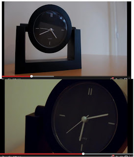
Time Lapse Shots

Strengths:
- The shots are nicely composed using the rule of thirds.
- The shots link together nicely using lighting due to how the second is later in the day and so the lighting was darkened somewhat.
- The shots help push the narrative by how time is passing and she is getting more frustrated so the second shot is closer and more intense.
Weaknesses:
- The shots are a bit too white and don't match the rest of the footage well because of this; they should have been graded a bit more orange to match the shots around them. - The glare on the clock in the first shot is a bit off putting and the glass should have been taken out of the clock really.
Dinner Shots
- The shots is again composed using rule of third and triangles. The long tracking shot starts with the door covering two thirds, and then the track uses a reveal to finish on a composition where she is sat on a third line and a triangle can be formed between her and the two glasses, drawing the eye across the table.
- The shots are all lit nicely and any key objects in the scene are clear to see. A gold reflecter board was used to mimic the orangey lighting seen in the kitchen earlier on.
Weaknesses:
- The close up pan doesn't really follow any particular composition, however seems to still work quite nicely.
Coming Upstairs Shot
Strengths:
- The track runs smoothly throughout and Sarah is kept nicely in the middle of the frame the entire way through the movement.
- The composition of the shot was purely to keep Sarah in the centre of the shot as the narrative is starting to make her feel more alone and vunerable, so she would move off the thirds and into the centre of the frame. Instead, the barrier ends on the third.
- The shot is lit well and keeps in tone with the rest of the film so far, slowly moving away from the oranges of the kitchen by becoming more white.
Weaknesses:
- The pan up at the start of the shot possibly takes away some of the nice horizontal movement and seems slightly unecessary.
At the Window Shot
Strengths:
- The shot is composed nicely, keeping both the window and Sarah in the frame at all times.
- The light from the right looks quite nice giving nice colouring to her arm.
Weaknesses:
- The overall shot is too dark and her features aren't as clear and sharp as they should be.
- An extra light from outside the window or from the bottom left was needed really and neither were practical.
- The shot features too much noise due to the low lighting.
Bedroom Shots
Strengths:
- These shots feature a new colour scheme which is the blues or silvers that mimic the look of moonlight coming in through the bedroom window. These colours were chosen here as they match the blues on the bedding and the silvers in her top. The led lights built into the furniture really helped to highlight this.
- The close up shot really uses the lighting well by highlighting the outline of her face.
- The close up shot also work nice compositionally by using the rule of thirds.
Weaknesses:
- Due to the window shot being orangy the colour change seems too sudden.
- The lighting continuity is wrong as there is no lighting on her chin in the wide or mid shots.
Doorbell Shot
Strengths:
- The shot is lit really nicely by the outdoor lamp and the lens flare adds something extra to the shot instead of it being a dull shot of a doorbell.
- The pull focus worked really nicely to highlight that something in the shot has changed, and the lens flare moves nicely as the focus changes.
- This shot uses another rule of thirds composition as the only thing of key importance here is the doorbell which needed to be somewhat unexpected.
Weaknesses:
- The shot feels slightly random and the composition gives off a slightly uneasy feeling which wasn't intended but I now like this element as it makes the audience think about who it could be and what Sarah will do about it.
Coming Downstairs Shot

Strengths:
- This shot is one that I am particularly proud of due to the complexity of the camera move.
- The shot is lit well by only ceiling lights and the lighting is therefore consistant throughout the movement.
- Sarah is kept well in shot for the entire move and the camera follows her nicely, making her feel vunerable with regards to who is at the door and what's going to happen.
Weaknesses:
- the only real weakness I see with this shot is that you cannot see her face for long enough, but that is because of the type of camera move and nothing could have been done about it.
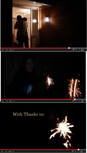
Outside Shots

Strengths:
- The first and last shots work well with the way that they are lit:
- The first is somewhat silhouetted by the backlight from inside the house, with the outdoor light being used as a fill light to prevent the rest of the shot from being black.
- The last shot is meant to be black with only the close ups of the sparklers as this works really nicely over the credits instead of just having a blank page with some writing on.
- The second shot works fairly well in the sence that you can only see what you need to see.
Weaknesses:
- The outdoor shots are all a bit to different colour wise: the first is fairly white and clean, and the second is too blue on her face.
- The second shot needed more lighting on Sarah, but the use of natural light was rather limited at night, and so the light coming from a rather small window had to be relied on.
Overall Conclusion
Strengths:
- The project ran very smoothly and there were no major problems encountered.
- The overall lighting on the film was very nice and in some areas to a high standard.
- The project was composed well for the majority using rule of thirds and triangles.
- The colouring of the project was overall very nice and pleasing to watch with a change in colouration as she moved to different areas of the house.
- The continuity throughout the project was pretty good and only fell down at a couple of points in the film.
- The chosen style of naturalystic was maintained throughout; only using the practical and natural lights available.
- All aims and objectives have been met to a good standard.
Weaknesses:
- The lighting in some scenes needed improving to better enhance and sharpen the image with a reduction on the amount of noise recieved.
- More compositional elements should have been included such as circles.
- Better time management would have meant that editting and colour grading wouldn't have been as rushed.
- More test footage done prior to filming might have helped save a lot of time during the filming stages, leaving more time for colour grading.
Overall I am very happy with the work that I have produced. I see myself as an FX student and not a film student and so this module has provided me with a huge learning curve: having never done a pull focus or used a track before the final film is something that I am very proud of.


